
This is a very cool piece by the great design studio Sagmeister & Walsh, NYC. It is a very cool concept and they needed some help in order to be executed properly.
I was in charge of the whole post-production process which included photo retouching, compositing, color correction and grading. It took approximately 35 hours of intensive Photoshop work over several days. I think it came out very well.
Let me show you what I did.
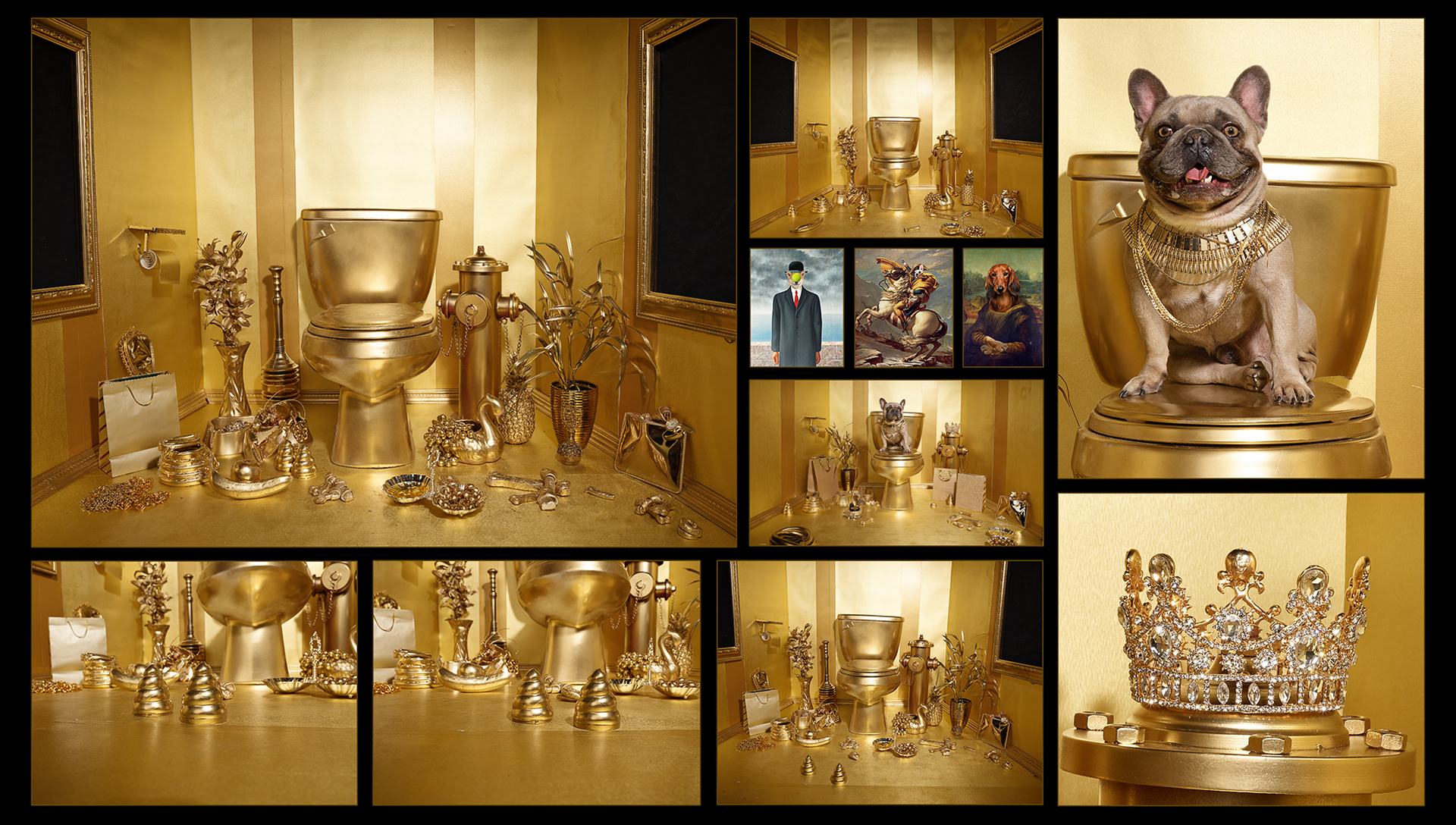
The source material
The majority of the shots were taken on a set full of props which were re-aranged in different setups for me to pull elements from, including our main subject. Shots were taken with a Phase One medium format camera and sent to me in RAW. I processed all of them first in Capture One so I could level them up in terms of contrast, sharpness, color, etc.
There was one picture in particular with the most elements right and that was the one used as the base for the background. Tons of work to be done before even start placing the rest of the elements on it.
The prep work
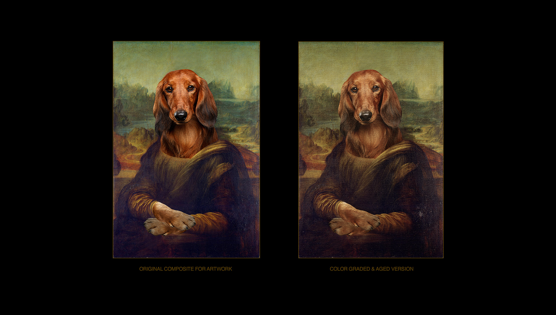
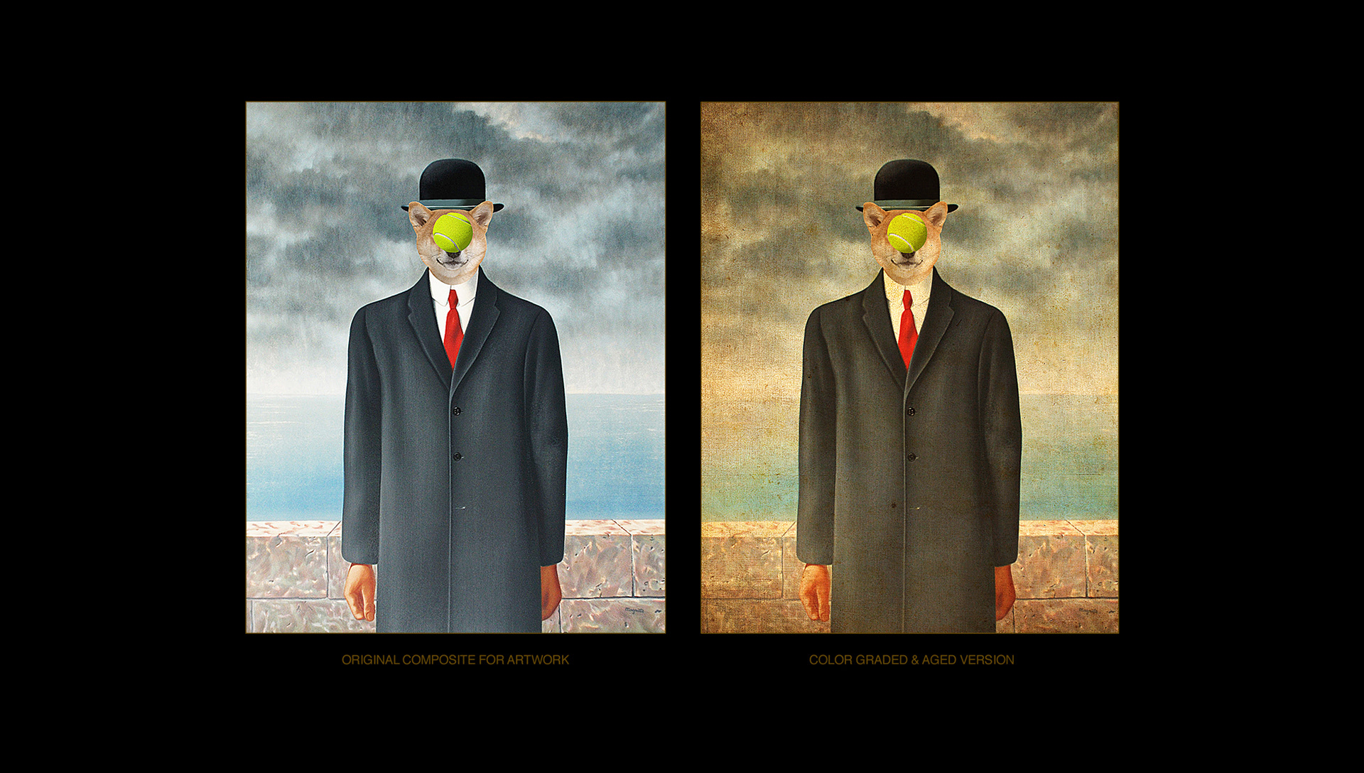
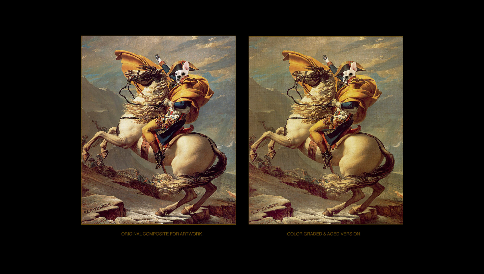
The artwork for the frames was also provided by Sagmeister & Walsh as mockups. They were dog themed reinterpretations of famous paintings.
What I did was to smooth the composites a little. They were kind of rough. I also aged them so they would look older and better integrated with the main scene later.

Cleaning up
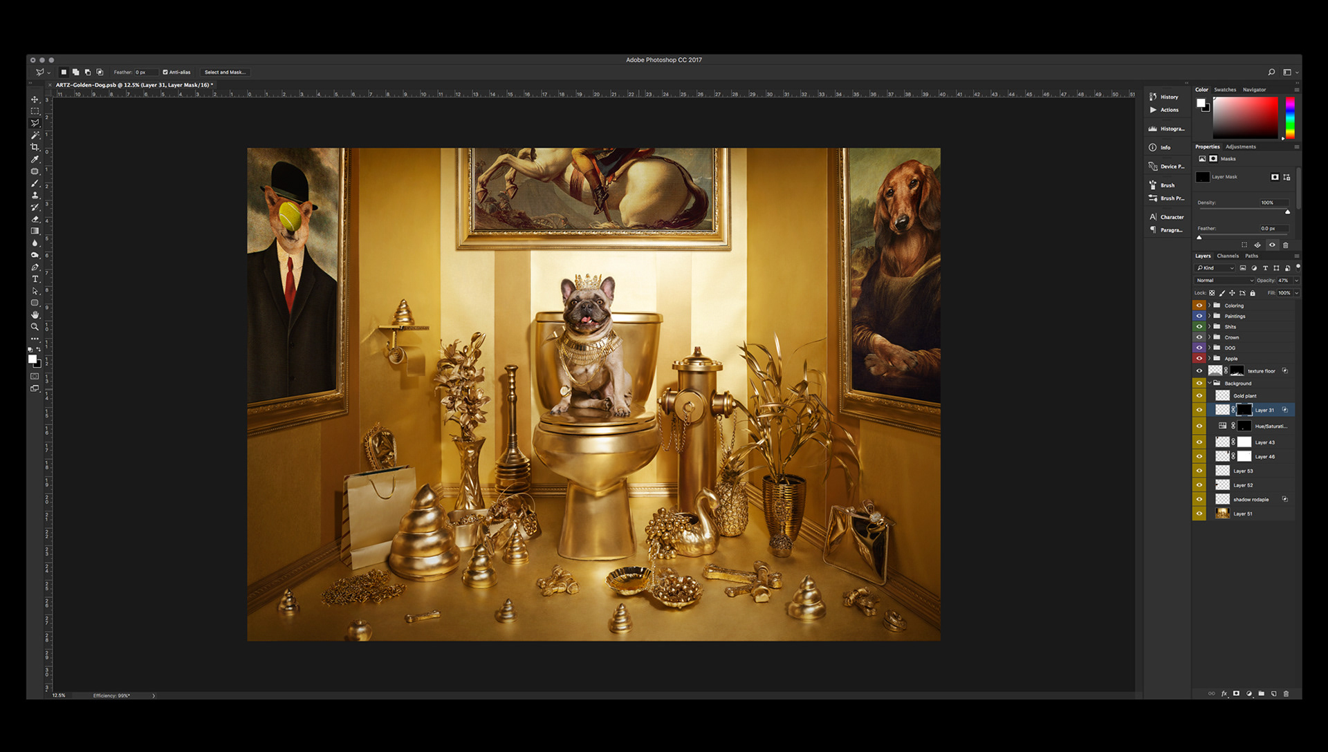
This is where the intensive work begins. First I need to retouch the main scene picture, smooth all textures and correct thousands of little imperfections in the wallpaper and the gold paint used on most of the elements.
I used a lot of spot healing brush in Photoshop, regular brush and stamp tool on the elements.

Straighten up
The studio asked me to straighten up the walls (easier said than done!). All shots were taken with a wide angle lens so the distorsion was pretty heavy. I had to correct and compensate for it by recreating parts of the walls and the frames.
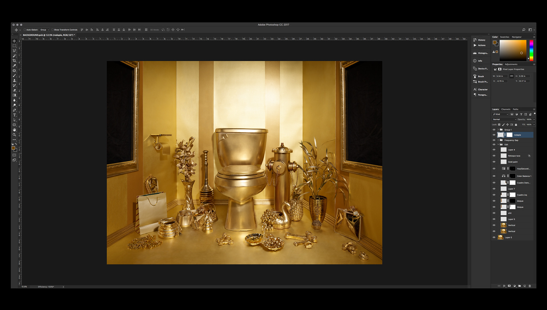
I removed some elements from the floor as they were going to be replaced later by other gold elements. In order to smooth the textures of the walls and floor frequency separation techniques were applied.
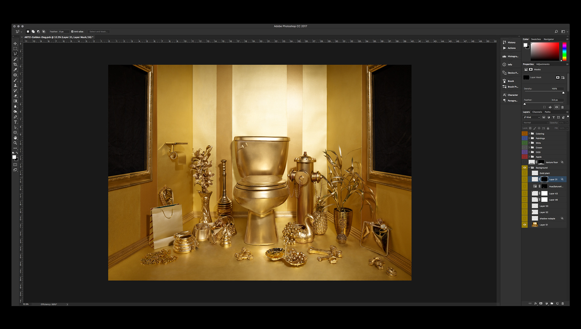
The studio asked me to extend the left wall a little bit in order to have a real sense of symmetry to the composition. The toilet throne needed to be right in the center.

Additional touch-ups. I extended the side frames so we don’t see the upper corners. I also cleaned up the dog’s water in the container next to the golden grapes (I missed it somehow in the first pass, I don’t know why, sorry!).
Adding the rest
Now I can place the artwork on the frames. They look pretty cool, like they belong there.

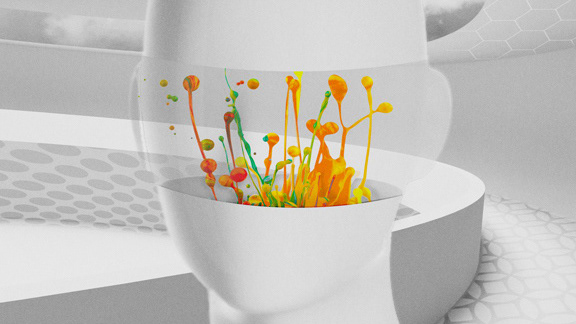
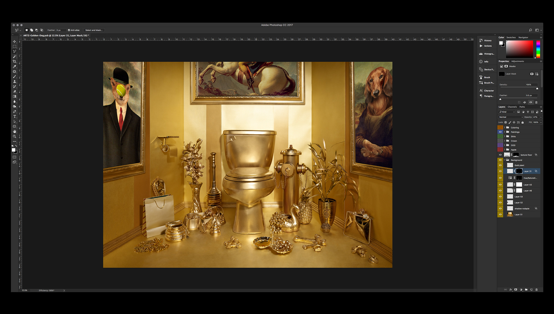
Next step is to cut out, retouch / polish and place all the golden poops and little elements on the floor. I worked on their shadows and reflections as well to integrate them properly around the scene.
Now it is time to add our main subject: THE KING DOG. Also to put the crown on its head, the watch and the ring on its leg and paw. A lot of retouching had to be done to the toilet’s seat to clean up the dog´s reflection.
Color grading
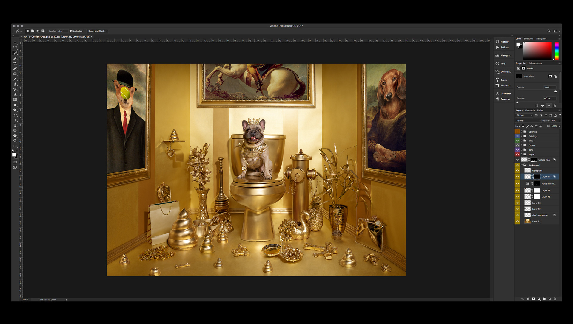
Finally the color grading process. The studio had a very clear vision for the overall look: 1970’s fashion, Guy Bourdin style.
With that reference in mind I tried to accentuate the richness of color, specially the golden elements on the floor. I wanted them to look saturated with lots of contrast for volume purposes.
I used a special LUT as a color base, different adjustment layers and some light grain to simulate some of that vintage film photography look. It’s subtle but it is there. Vintage film photography tends to be somewhat blurry and coarse. I didn’t want to go for that. It is 2018 after all, things look more clean and pristine now, even if they are retro inspired.
I also used Curves to create a vignette around the King Dog for it to remain the center of attention and the main focal point of the image.
Lastly, some extra sharpening where needed using a few layers of high-pass filter in specific areas.
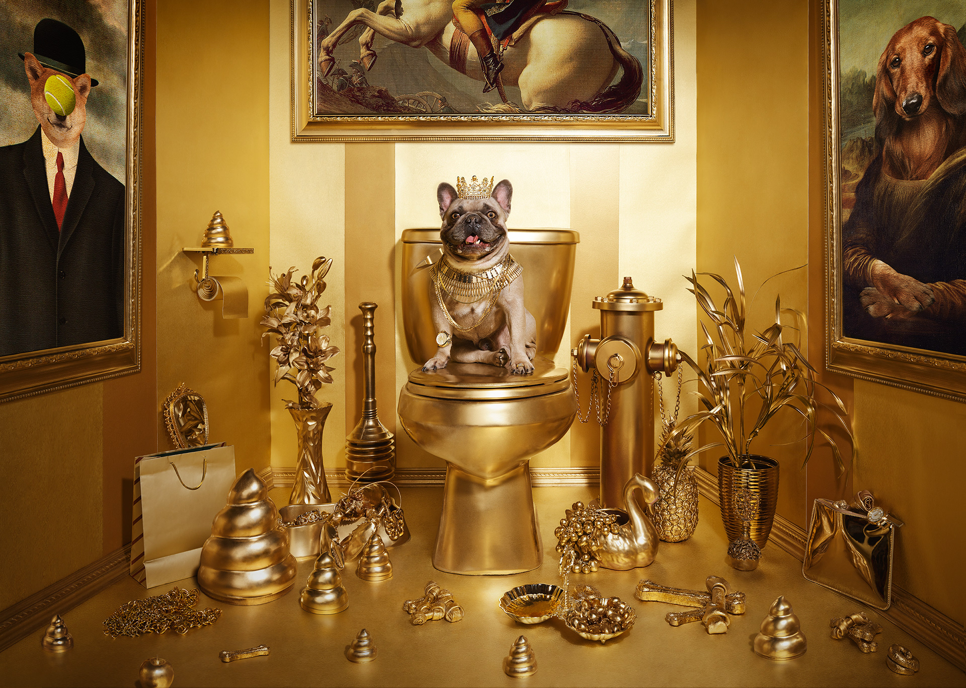
And there you go, the image was finished. It was hard work but a lot of fun also. I think it looks great! The studio was very happy with the result. I hope you like it as well.
THANKS FOR CHECKING OUT THE PROCESS!
CREDITS
Concept: Sagmeister & Walsh, NYC
Source Photographic Material: Sagmeister & Walsh, NYC
Art Direction: Jessica Walsh
Producer: Erica Grubman
Retouch / Compositing: Carlos Jiménez