This piece was conceived by the great design studio Sagmeister & Walsh, NYC. My involvement consisted in helping with the post-production of the final digital artwork which included photo retouching, compositing, color correction and grading.
There are approximately 30-35 hours of retouching and composite work in Adobe Photoshop® over several days on this piece. I think it turned out great and the studio seemed to like it a lot as well. Let me walk you through the process.
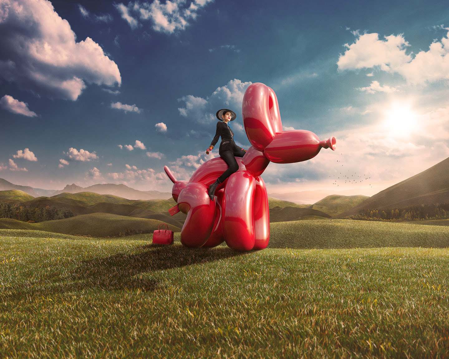
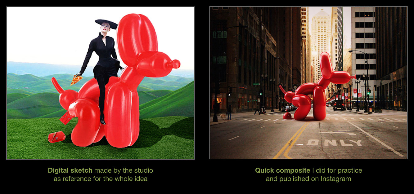
This was the first project I made for S&W. If you were wondering how I got this gig? Basically the studio had a very clear idea which involved an epic landscape background with a fierce fashion model riding a red balloon dog like the sculpture made by famous artist Jeff Koons. They made a digital sketch in-house of what they wanted so when looking for references they found one of my quick composites I made for my Instagram account which coincidentally had also a red balloon dog. They checked my work and then the producer from the studio contacted me directly and we went from there. So, pretty straight forward, the usual 21st century way of finding and hiring talent.
The source material
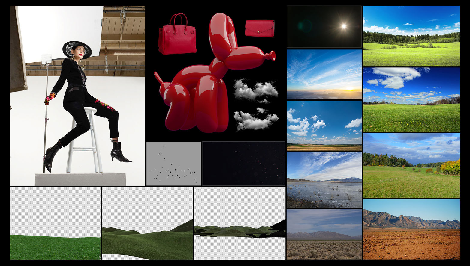
The final composite is a collection of images from different sources. Some of them were stock photos plain and simple, others were shot on a studio by a professional photographer like the girl and the bags. The dog, the hills and foreground grass were made from scratch by a very talented 3D artist from Barcelona named João Lucas. He was awesome to work with and has an incredible body of work. He told me he had worked as an intern at S&W before. I thought that was super cool.
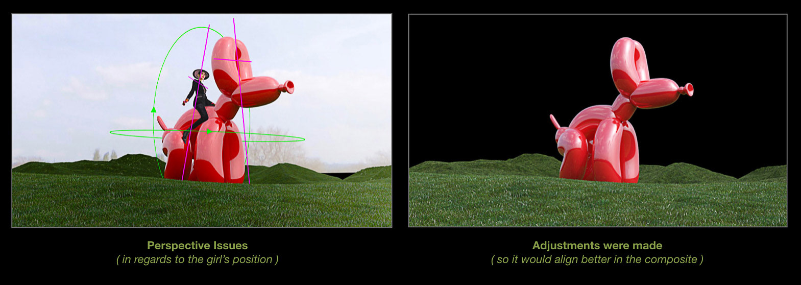
The original 3D model of the dog had perspective issues. It needed it to be tilted and rotated a little so it would match the perspective of the girl a little better. I made a quick composite to show João what I needed. He made the adjustments and sent the dog, hills and grass in a in a hi-res layered file for me to work with. I specifically asked him to make it a 16 bit color file cause I prefer to work in that color depth. I know working hi-res images in 16 bit color demands a lot from my computer but the result simply looks better. Also it helps avoiding color banding when working with photos of the sky (which usually have many gradients).
The girl on the dog
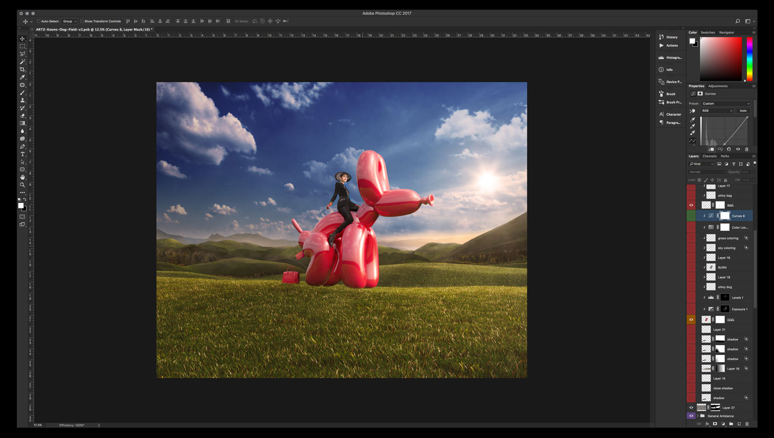
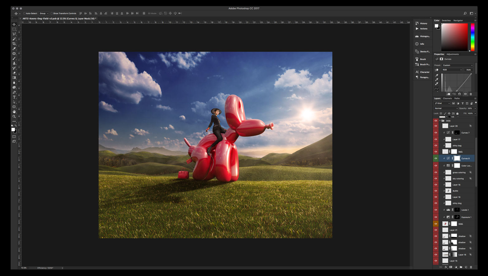
I started with the composite of the girl riding the dog since I wanted to have them as a whole main subject to place in the later composed background.
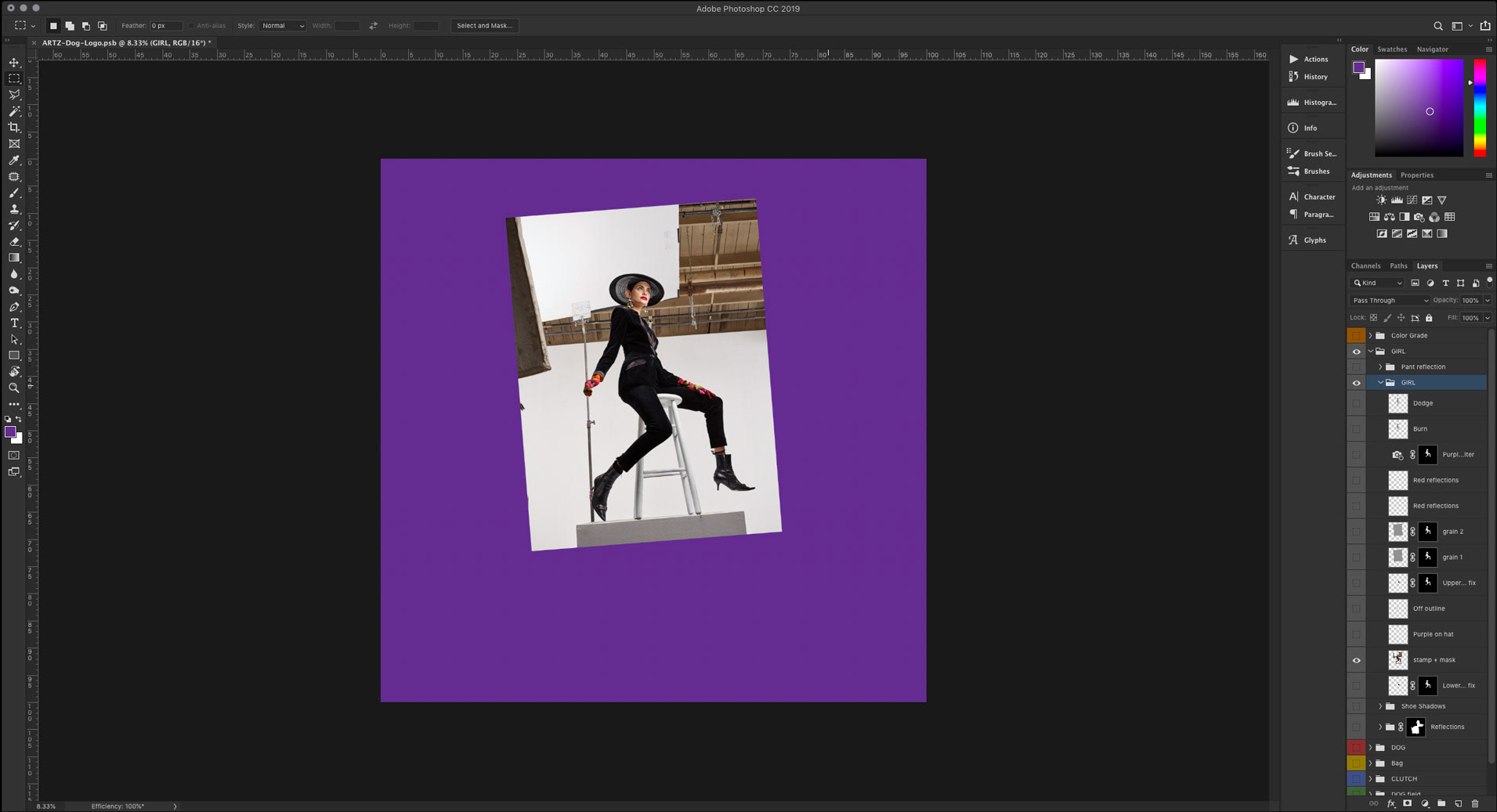
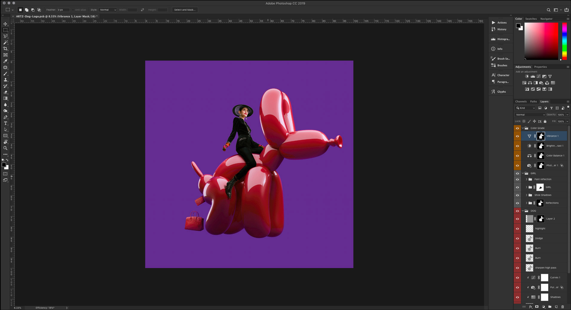
So, pretty standard stuff. First thing, masking the girl out the studio background and filling the gap made by the stool on her left thigh.
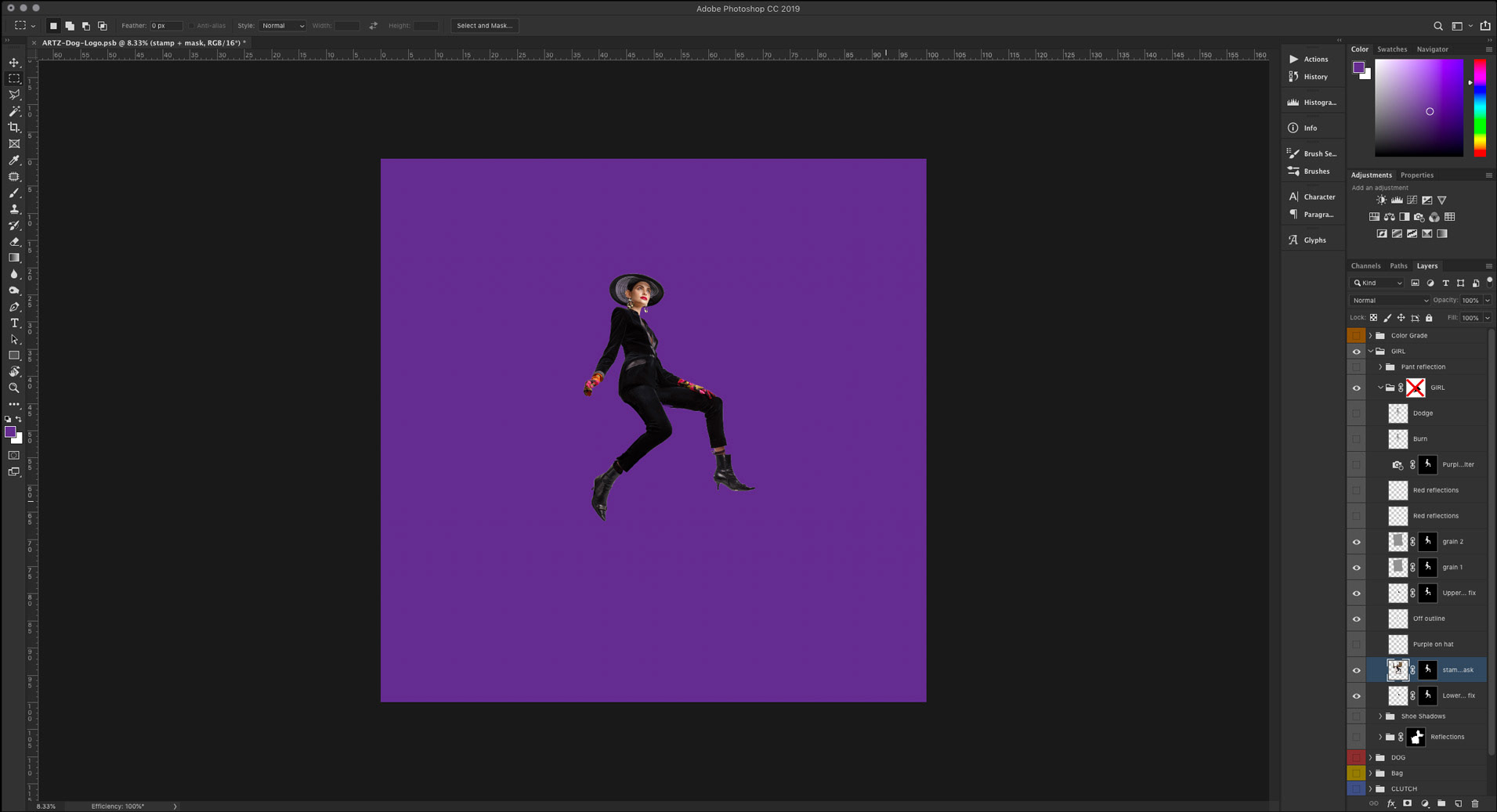
Then I incorporated the 3D render of the dog. Proportions matter so it is very important to adjust its size and position so the girl looks natural riding it. I wanted to look like she had her right foot resting on the dog’s back leg.
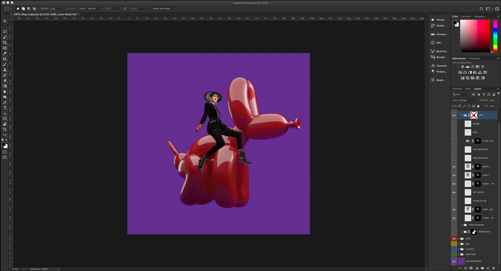
Once you have the proportions right I masked the girl’s leg, worked on the shadows and reflections of the girl on the dog. Then I placed and integrated the bags as if the dog is pooping them and made some general lighting and color corrections to integrate all elements better.
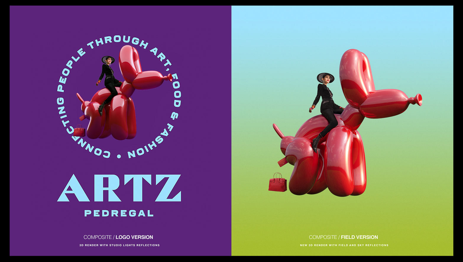
The two versions
There were two versions of the 3D dog used for different purposes. One with studio lights reflections which was used as part of a logo composition for the client and another one with the field and sky reflections so the integration with the background in the final piece made sense.
João was kind enough to supply both versions of the render in the exact same position which made my job a lot easier. Otherwise I would have had to retouch my way around the reflection’s swap which would have been a nightmare.
The final composite
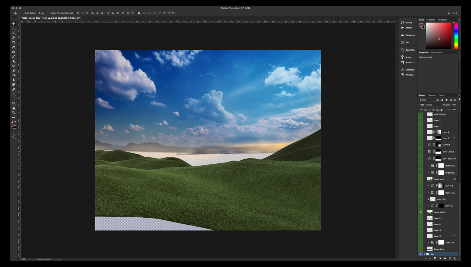
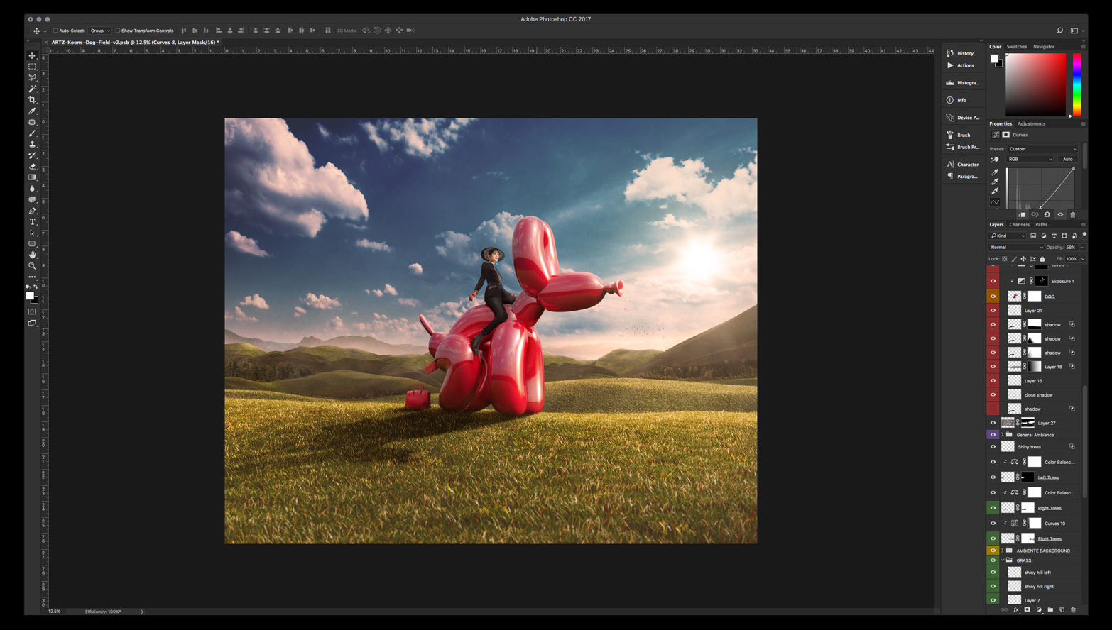
Now it is time to work on the background finally! Usually I start with the sky. I went for an epic kind of sky with clouds and for that I had to build it out of multiple images in order to balance the open sky to cloud ratio.
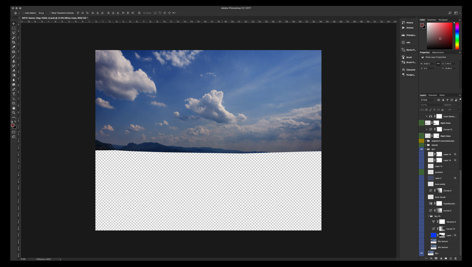
Once the sky is balanced in terms of elements I start to add more layers of depth: distant mountains, fog, sunshine. Minor color corrections and grading are applied in order to make all the layers blend correctly.
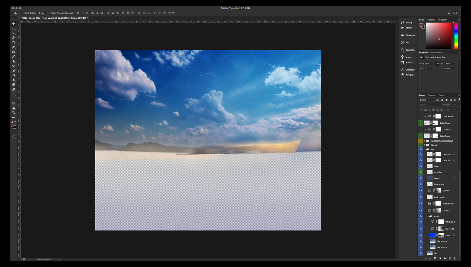
Then I moved to placing the foreground field, hills and grass.
The 3D render was provided in many separate layers so I could arrange them according to my needs. I worked on the ones in the middle first because those would determine the right proportions for the back ones and the main grass in the foreground.
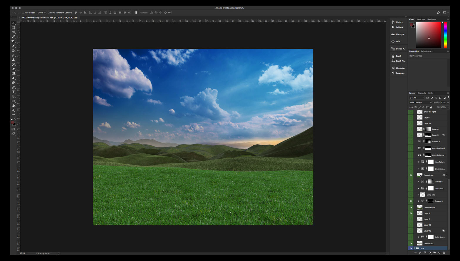
Once they were placed correctly it was a matter of working the color and lighting, specially the highlights so they look more integrated overall.
But first we need to add our main light source. The one that determines how strong of a shadow our dog and female rider will cast on the grass. I added some stray rays of light and some dust particles so it looks more organic.
I also added some trees and bushes to the hills so we have a reference of size for the dog and the girl. At the same time it adds more depth and texture to the background.
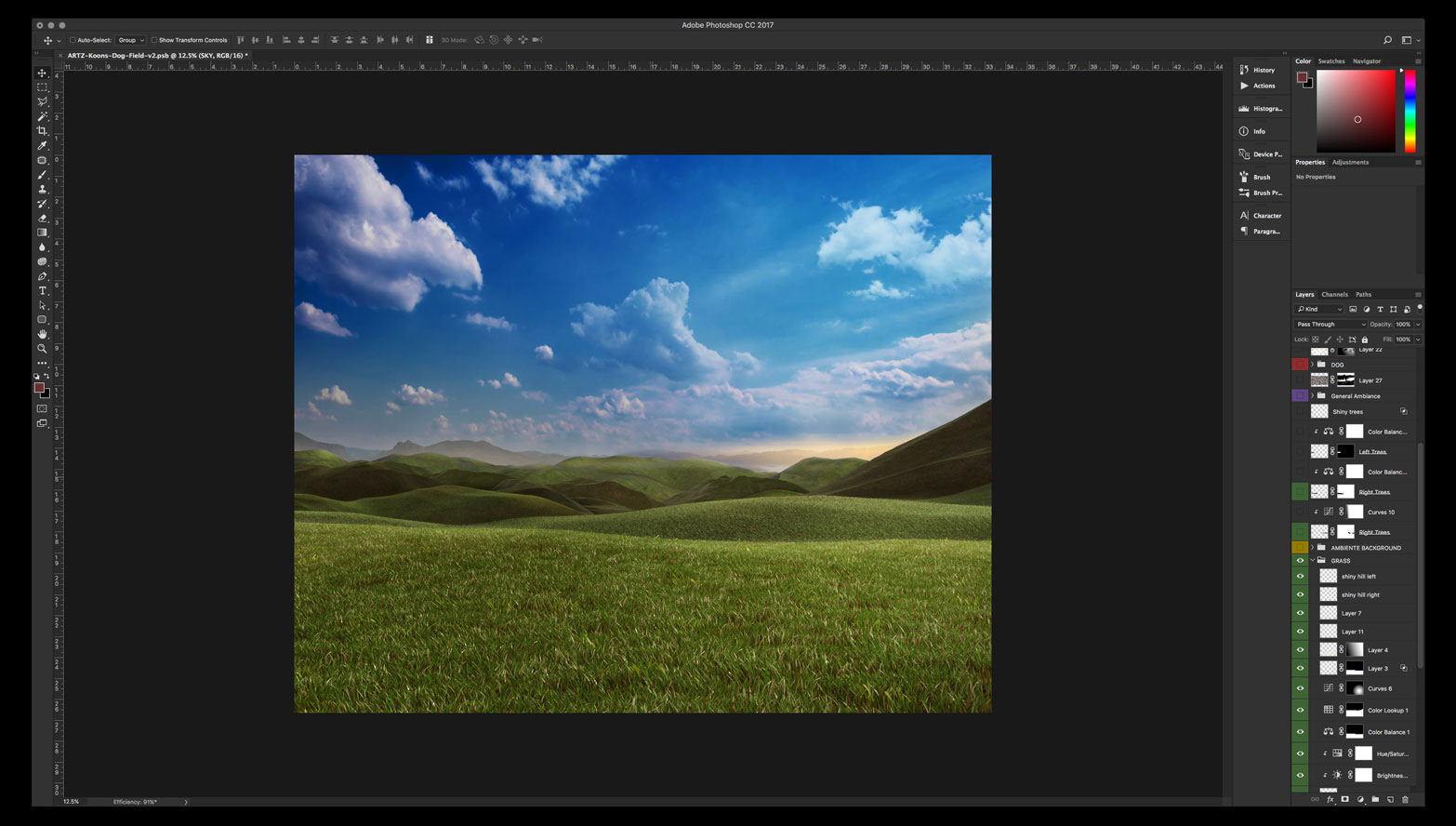
With those corrections made the background starts to take shape and looking more epic as intended. Now we have a good foundation to place our main subject.
When placing the main subject we need to make sure the light source affects all the elements with similar intensity so I needed to bump up some of the highlights and shadows on the grass in general, not only the ones in the foreground.
With the more intense highlights there is also a boost in color vibrance. Same adjustments need to be done to the reflections on the glossy surface of the dog.
Now it is time to work on the shadows of our main subject based on the current state of lighting and color of the background. Our main light source determines not only how the dog and girl cast a shadow on the grass but also how the highlights and shadows of them are afected by the light source.
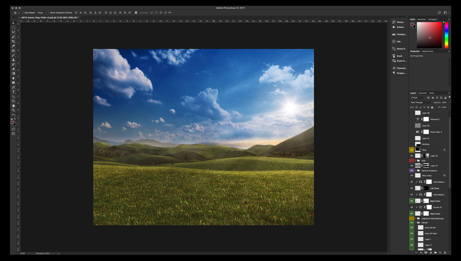
Lastly, color grading. The studio wanted to go for that 70’s film look in the afternoon or early sunset. Jessica provided some reference photos for the color grading so I could extract an average color palette.
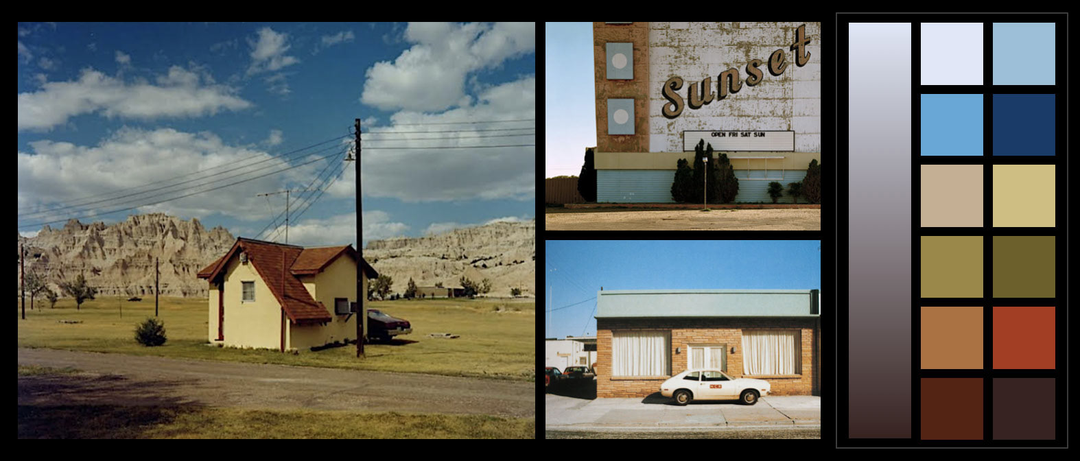
With those references and color palette I made some adjustments in the general color casting. I bumped the saturation so the colors wouldn’t look that muted. Specially the dog, which would look more orange than red.
I felt I needed to keep it bold and kind of “in your face”. I mean, not only is the focal point of the image but also is a giant red ballon dog on a green field, it doesn´t get any more contrasted than that (color wise).

That was it, the job was done. It was a long way and a big difference from the sketck to the final image but it was a lot of fun also. I hope you enjoyed checking this project as I did working on it.
Thank you for checking out the project!
CREDITS:
Concept: Sagmeister & Walsh, NYC
Art Direction: Jessica Walsh
Producer: Erica Grubman
Retouch & Composite: Carlos Jiménez
3D Artist: João Lucas
Photoshoot: Sagmeister & Walsh, NYC
Stock Photography: ShutterStock